8 Best Hospital Website Designs for 2026 Inspiration
When people are trying to decide where to go for care, unless it’s the kind of emergency where the nearest hospital is the only option, they typically start with a search bar and a hospital website.
That first visit to your site is all about building trust, and great healthcare website design does a lot of heavy lifting in that regard, by making complex care paths feel understandable and reassuring anxious visitors that they are in the right place.
So, the best hospital websites are those that feel calm and trustworthy, making it easy to find a doctor, understand services, see locations, and book appointments, without forcing visitors to fight the interface.
The list is not ranked, as each site offers a different kind of inspiration you can borrow.
Cleveland Clinic (United States)
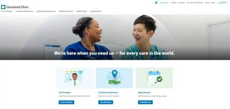
Cleveland Clinic’s website is a good example of a huge health system that still feels manageable online. The homepage focuses on a tight set of jobs to be done instead of trying to show everything at once.
From the top of the page, you can quickly jump into “Our Providers,” “Locations & Directions,” and “Appointments.” These actions are visually prominent, so a first-time visitor who is stressed or in a hurry does not have to dig through menus to take the next step.
Mayo Clinic (United States)
Mayo Clinic’s site leans heavily on clarity and calm. The homepage headline “Healing starts here” sets the tone, and almost everything on the page supports that promise rather than distracting from it.
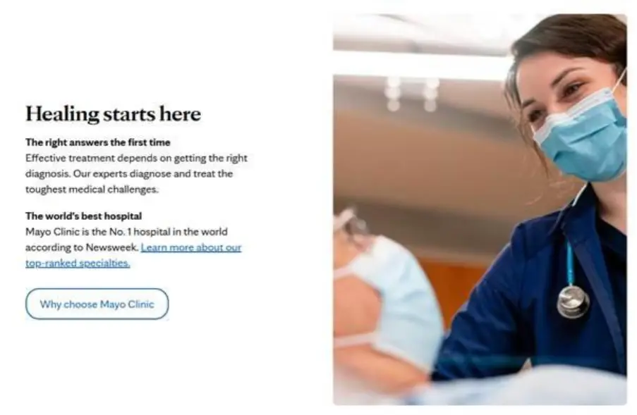
The main navigation mirrors how patients think, with conditions and treatments, tests and procedures, and appointment options easy to explore without medical jargon. The site’s search is fast and forgiving, so a visitor who types “heart palpitations” or “knee pain” feels like the site understands their language.
Seattle Children’s Hospital (United States)
Seattle Children’s has a site that feels distinctly built for parents and young patients instead of just being a generic hospital template with a cartoon mascot on top. Key tasks such as “Make an Appointment,” “Pay My Bill,” and “Find a Location” are easy to reach from anywhere on the site.
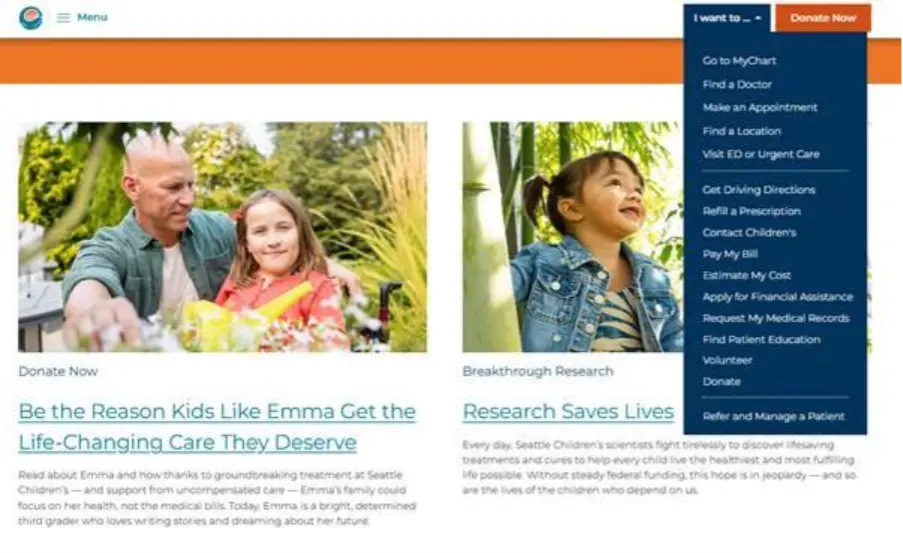
The tone of the copy is reassuring and practical. Parent education content, safety information, and event listings sit alongside clinical services without overwhelming the page, while photos and graphics are used carefully to show real families and staff rather than stock imagery, which adds to the sense of trust.
Mount Sinai Hospital / Mount Sinai Health System (United States)
Mount Sinai’s website is a strong model of the “digital front door” idea. Right on the homepage, you see a clear message about its Newsweek ranking and a prominent entry point into on-demand virtual urgent care, tapping into the growing expectation that at least some care can start online.

The design nudges visitors toward concrete actions from the moment they land on the site. “Get Care Now” sits alongside options to book an appointment and download the MyMountSinai App.
All this matters because surveys show that around 61% of healthcare consumers rate the availability of online appointment scheduling as extremely or very important when choosing a new provider or location.
Singapore General Hospital (Singapore)
Singapore General Hospital’s site is a good example of how to keep a large, specialist-packed teaching hospital approachable. The tagline “Where Care Meets Excellence” is short and plain, and the homepage focuses on patient-centered tasks before institutional messaging.
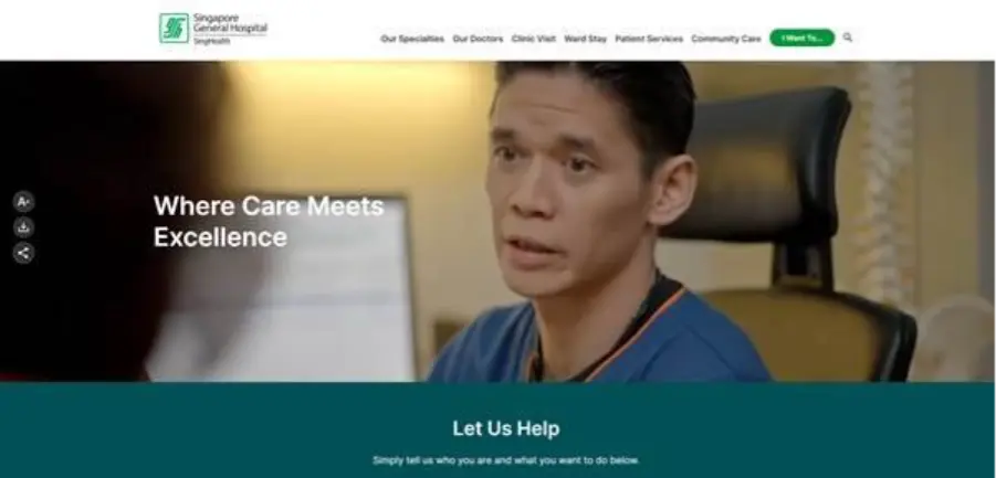
Service information is grouped into intuitive categories, and the site makes it easy to see how to get to the hospital and what to expect. Contact and location details are visible throughout the website, which helps both local and regional patients who might be travelling for care.
Karolinska University Hospital (Sweden)
Karolinska University Hospital’s website carries the weight of a major European university hospital without feeling academic or closed off. The navigation is organized in such a way that patients, relatives, healthcare professionals, researchers, and job seekers each get their own route through the site.
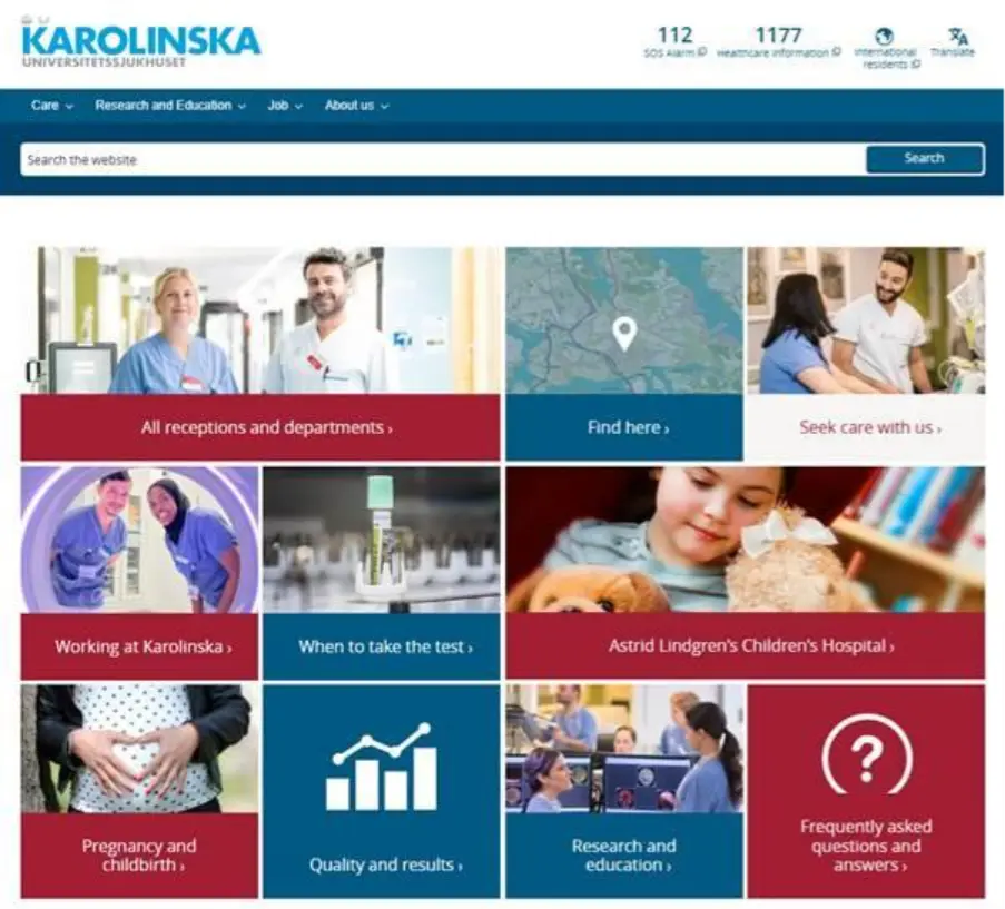
Within the patient-focused content, the site leans heavily on clarity and accessibility. Information about highly specialized care is broken into short sections and supported by simple explanations of what the hospital does and how referrals work. Accessibility statements and information about the site itself are easy to find, which is important for visitors with disabilities or assistive technologies.
Sheba Medical Center (Israel)
Sheba Medical Center’s global-facing site is designed around the idea of offering “World-Class Medicine with a Personal Touch.”
The homepage quickly communicates scale, saying that Sheba is the largest, most comprehensive hospital in the Middle East, with hundreds of departments and clinics, pairing this with a very clear “Request a consultation” call-to-action for international patients.

The navigation mirrors typical patient questions of why choose this hospital, how the global patient service works, what the benefits are, and how to start the process. Content is framed in terms of outcomes and support rather than technology alone, which helps reduce anxiety for people travelling far from home for treatment.
The Royal Melbourne Hospital (Australia)
The homepage of the Royal Melbourne Hospital’s website highlights its role as one of Australia’s leading public healthcare providers, and shows key journeys such as careers, training, and patient information in a clean, card-based layout.

Service information is presented in a way that recognizes how many visitors will be on phones with short headings and clear links to the “Health Hub” make it easy to navigate on smaller screens. Visual cues are used to guide the eye to important actions instead of relying on long, text-heavy lists.
What These Hospital Websites Get Right
Across different countries and health systems, these eight hospital websites share a couple of consistent themes. They organize information in plain language and lower the cognitive load of using the site, which directly supports health literacy and better decision-making.
On the design side, they quietly follow best-practice usability guidelines with clear navigation, consistent layouts, accessible contrast, and a responsive design that works on older devices as well as the latest phones.
Whether you are redesigning from scratch or making incremental improvements, starting with a crisp promise and a small set of high-impact actions will bring your site much closer to the examples above, and more importantly, closer to what patients actually need in 2026.


