 Skip to content
Table Of Content
Optimize Cumulative Layout Shift
1. QuickRead
Users may be irritated by layout changes. Assume you’re reading an article when suddenly elements shift around the page, throwing you off and needing you to re-find your place. This is extremely widespread on the web, notably while reading the news or trying to click those ‘Search’ or ‘Add to Cart’ buttons. Such encounters are visually shocking and frustrating. They are frequently triggered when visible items are forced to relocate because another element was unexpectedly added to the page or resized.
Cumulative Layout Shift (CLS), a Core Web Vitals metric, assesses content instability by aggregating shift scores from layout shifts that do not occur within 500ms of user interaction. It considers how much visible content moved in the viewport as well as how far the impacted objects were shifted.
This tutorial will go through how to optimize typical causes of layout shifts.
2. What causes Cumulative Layout Shift?
The following are the most typical causes of a bad CLS:
- Using images without specifying their dimensions
- Embeds, banner advertisements, and iframes with no dimensions
- Any material that is dynamically injected
- Using fonts incorrectly, resulting in a flash of invisible text (FOIT) or a flash of unstyled text (FOUT)
- Actions that wait for a network response before modifying the DOM
You Might Be Interested In: Magento 2 Speed Optimization Services
3. How can you identify which elements are causing CLS?
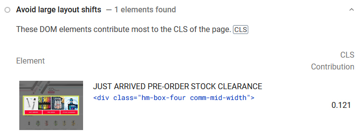
PageSpeed Insights – the “avoid big layout shift” report on your Diagnostics section shows you which individual elements have the biggest CLS contribution, along with an image of them.
Layout Shift Regions in Chrome Dev Tools — witness layout shifts highlighted in blue while you browse your website in real-time. Here are the steps to enable layout shift regions:
- Launch Chrome Dev Tools
- Launch the Command Menu.
- Start typing “Rendering.”
- Use the Show Rendering command to display the rendering.
- Check the Layout Shift Regions box.
- Layout changes are highlighted in blue when you interact with a page.
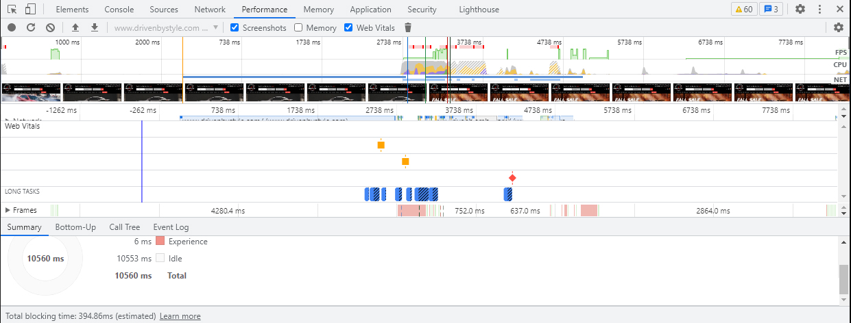
The Performance panel in Google Chrome’s DevTools displays layout changes in the Experience row. The Layout Shift Summary view displays the overall layout shift score as well as a rectangle overlay highlighting the impacted zones.
4. Images without dimensions
Include width and height size attributes on your ![]() and video components at all times. Alternatively, CSS aspect ratio boxes can be used to reserve the necessary space. This method guarantees that the browser allots the appropriate amount of space in the document while the image loads.
and video components at all times. Alternatively, CSS aspect ratio boxes can be used to reserve the necessary space. This method guarantees that the browser allots the appropriate amount of space in the document while the image loads.
In the early days of the web, developers would add width and height attributes to their ![]() tags to ensure enough space on the page was provided before the browser began fetching images. This would reduce the need for reflow and re-layout.
tags to ensure enough space on the page was provided before the browser began fetching images. This would reduce the need for reflow and re-layout.
<img src="puppy.jpg"alt="Puppy with balloons"width="640″height="360″/>
You may have noticed that the width and height above do not include units. These "pixel" dimensions guarantee that a 640×360 space is allocated. Regardless of whether the real dimensions matched or not, the picture would stretch to fit this space.
When Responsive Web Design was introduced, developers started omitting width and height but instead used CSS to resize images:
img
The disadvantage of this strategy is that space could only be allotted for an image once it began to download and the browser could determine its dimensions. The website would reflow as images are loaded in, and each image would appear on the screen. It became usual for text to appear unexpectedly on the screen. This was not a good user experience.
This is where the aspect ratio comes into play. The aspect ratio of an image is the ratio of its width to its height. It's usual to see this expressed as two numbers separated by a colon (for example 16:9 or 4:3). The image has an x:y aspect ratio when it is x units wide and y units high.
This means that if we know one of the dimensions, we can determine the other. For a 16:9 aspect ratio, write:
- If puppy.jpg has a height of 360px, the width is 360 x (16 / 9) = 640px.
- If puppy.jpg has a width of 640px, the height is 640 x (9 / 16) = 360px.
The browser can compute and reserve enough space for the height and related area by knowing the aspect ratio.
Modern browsers now establish the default aspect ratio of images depending on the width and height attributes, therefore it's important to define them to avoid layout changes.
img
Before the image is loaded, this generates an aspect ratio based on the width and height attributes. It offers this information right at the start of the layout computation. When an image is instructed to be a certain width (for example, width: 100%), the aspect ratio is utilised to compute the height.
The browser can compute and reserve enough space for the height and related area by knowing the aspect ratio.
If your image is in a container, you may scale it to fit the width of the container using CSS. To avoid the image height being a fixed value, we specify height: auto (for example 360px).
img
What about images that are responsive?
When dealing with responsive images, srcset determines which pictures the browser may choose from and what size each image is. Each image should have the same aspect ratio so that the ![]() width and height attributes may be specified.
width and height attributes may be specified.
<img
width="1000″height="1000″src="puppy-1000.jpg"
srcset="puppy-1000.jpg 1000w,puppy-2000.jpg 2000w,puppy-3000.jpg 3000w"
alt="Puppy with balloons"/>5. Ads, embeds, and iframes without dimensions
Ads are one of the most significant contributors to web layout changes. Dynamic ad sizes are frequently supported by ad networks and publishers. Because of greater click rates and more advertisements participating in the auction, ad sizes improve performance/revenue. Unfortunately, because advertising pushes visible information you’re watching down the screen, this might result in a poor user experience.
Ads can cause layout shifts during different points of their lifecycle since they’re usually loaded asynchronously. These points being:
- When a website puts an ad container into the DOM
- When a site uses first-party code to resize the ad container
- When the ad tag library begins to load (and resizes the ad container)
- When the advertisement fills a container (and resizes if the final ad has a different size)
The good news is that by following best practices, sites may decrease ad shift. These layout changes can be mitigated by:
- Reserve space for the ad slot statically.
To put it another way, style the element before loading the ad tag library.By restricting the slot size while inserting advertising in the content flow, you can ensure that any shifts are avoided. If these adverts are served off-screen, they should not cause layout changes.
- Non-sticky advertising should be placed at the top of the viewport with extra care.
- If no ad is returned while the ad slot is visible, provide a placeholder to prevent the reserved area from collapsing.
- By reserving the largest possible size for the ad spot, you may eliminate shifting.
This works, however, it runs the danger of leaving a vacant area if the slot is filled with a smaller ad creative.
- Based on previous data, determine the most likely size for the ad space.
In rare instances, the ad network may fail to send an ad to the container. If this occurs, do not collapse the container because this will result in a layout shift. Instead, use a placeholder. Unless you control the ad serving yourself, there is no straightforward method to pick the precise size each time.
Some websites may also use embeddable widgets to provide portable web content on pages (for example, videos from YouTube, maps from Google Maps, social media posts, and so on). Because the browser doesn’t know exactly what the embed is going to contain (for example, a social media post, an embedded image? A video? numerous rows of text?). As a result, platforms that provide embeds may not always reserve adequate space for them, resulting in layout changes when they eventually load.
To get around this, you can reduce CLS by precalculating enough space for embeds with a placeholder or fallback. You can use the following procedure for embeds:
- Examine your embed with developer tools to determine its height.
- Create a placeholder for the embed in these dimensions.
- You can also use media queries to adjust for variations in ad/placeholder sizes across form factors.
- When the embed loads, the enclosing iframe will resize to fit its contents.
6. Dynamically injected content
Except for user interaction, never add material on top of existing material. This guarantees that any layout changes are anticipated.
When trying to load a site, you may have seen layout alterations as a result of a UI that appears at the top or bottom of the page. This happens with banners and forms that modify the layout of the website, much like an ad.
When you decide to display these sorts of UI affordances, be sure to leave adequate space in the viewport for them. Use a placeholder or skeleton UI so that when it loads, the page content does not shift around abruptly.
7. Web Fonts causing FOIT/FOUT
When a browser wants to show text that uses a web font, it determines if the font is required and available (on the system or in the browser’s cache). If a font is required but not available, the browser will download it.
When a browser requests a font from a web server, each element that utilizes that font is hidden until the font asset is fully downloaded. This is referred to as FOIT, or flash of invisible text.
Similarly, until the custom font loads, browsers display a fallback font in the font stack. This results in a flash of unstyled text, often known as FOUT.
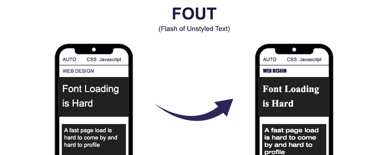
When the browser needs to fetch a font, it fills the text area with a fallback font, whether visible or not. When the font is finally accessible, the browser displays the text area using the web font once more. The temporary typeface, on the other hand, may not have the same qualities as the final one. Baselines, point sizes, and kernings may change, and the final text may be shorter or longer than the temporary text, resulting in layout changes.
Lighthouse can assist you in determining the actual source of CLS. If the fonts are to blame, there are some simple solutions. You may use font:display values instead.
These impacts can be reduced by utilizing font:display values such as auto, swap, block, fallback, and optional. However, if you want to be absolutely certain that no layout shift is occurring, use font:display in combination with the link rel=preload
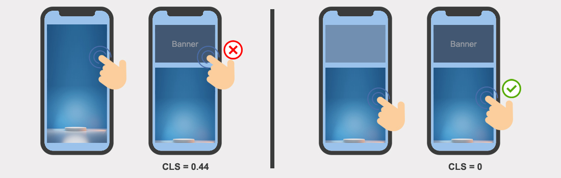
8. After 500 ms of interaction, content is inserted
The CLS algorithm ignores Layout Shifts for 500 ms after each active user interaction with the content or change in viewport size. Because of this behavior, most user interactions do not result in layout changes that are recorded in the Cumulative Layout Shift.
However, you must ensure that your user interface responds to user interaction inside the 500 ms limit. If your UI relies on network requests or intensive javascript processing, shifts may occur after 500 ms and will be accounted for in the Cumulative Layout Shift number.
To improve your CLS, do the following:
- Make sure that your transitions and animations that respond to user input last no more than 500 milliseconds.
- Measure and optimize the response time of your APIs.
- Anticipate the outcome of the network call(s) or lengthy treatment by assigning the result area during the first 500 milliseconds, even if it will be filled later (you can use an optimistic UI pattern).
- Implement a distinct user interface paradigm for extended processing and network calls (queuing and completion notification system, modals, etc)
- Only animate CSS attributes in Blink that do not cause layout changes.
9. Conclusion
Cumulative Layout Shift is a statistic that quantifies a web page’s layout instability. To optimize it and improve the user experience, avoid injecting material for which the browser hasn’t allotted enough space. There are various ways for pictures, but this will make advertising management much more complicated.
Remember that CLS is a new metric. We still don’t have enough input at scale. When in doubt, always prioritize enhancing the User Experience over the statistic. Some CLS optimizations may be counterproductive to this objective and should be avoided.
Some of our Magento 2 optimization Blogs


