 Skip to content
Table Of Content
Feb 15, 2021 | 08 min read
Best UX practices to create stunning Magento homepage design
1. QuickRead
While many would find it more enticing to focus on your Magento store’s product pages, it pays to concentrate on the home page as well. For your website, your homepage sets the tone. It’s the first source of data where people start criticizing or forming an opinion of what you have to offer. You must also ensure that the design of the Magento website is attractive and that the content is relevant.
Using your homepage to convey messages about your brand and engage people so they can further explore your online store.
The homepage needs to offer consumers a straightforward guide to three key product-finding paths:
- Key navigation facility,
- Check, Search
- Curated tracks such as newcomers or shopping wizards.
How do you plan your Magento homepage to achieve the highest click-through rates and lower bounce and exit rates? Pay attention to how the page is designed and what you put in it. In our article below, we will discuss the subject in more depth. We will illustrate the vital elements of your homepage and the best practices in the design process.
2. Header
The header plays a crucial role on every website, although it is a global Magento component and not an exclusive part of the homepage. The header should easily allow the first two most common paths for product finding, main navigation (which can be put as a sidebar, admittedly), and search.
Principal Navigation
A visual representation of the category taxonomy (the taxonomy category and information architecture will not be discussed here) is the primary navigation of the shop. It offers the primary method to search the store and to help customers locate items that they are searching for.
It has to offer a clear overview of product ranges, in essence. They can’t buy it if they can’t find it!
Top-level categories should always be included in the navigation (if possible, of course). This provides an outstanding overview of the type of site and its products. But it also sets the right expectations, so stop hiding them under a single label called “Products.” It’s great to visually indicate the hierarchy and group items when using a dropdown menu (especially the common mega menu).
Using various text styles or spatial markers, such as white spaces or borders, this is easily achieved. It makes scanning much easier and avoids selection paralysis. Often related to drop-downs – use a mark, such as a down-facing arrow, to indicate that the menu includes hidden items.
Search
Search is the second most popular way to find goods. It’s no secret that consumers who search are more likely to convert, so it’s extremely important to have a great search.
The search input field on its own should be long enough for a standard search query. Narrow fields result in scroll action and minimize usability. A search question button should also be available. Don’t depend on customers to know that the enter key will request a question.
One great way to improve usability is to include search suggestions and autocomplete to help direct clients.
Navigation courtesy
Courtesy navigation offers quick access to secondary actions and tools such as account, language or currency transfer, phone number, etc. This navigation also affects the clients, their experience, and their commitment.
Courtesy navigation should be conveniently accessible and positioned in a prominent spot, such as the top right corner of the header. We also see the use of icons for these actions, but using icons can be confusing, so text labels should be used as well. Not everyone will understand the significance of an icon, particularly if it isn’t a regular one (like three lines for menus, or a magnifying glass for a search).
3. Footers
Footer is also a global feature of Magento. It’s situated at the bottom of the page. An ungrateful place, because we all know it doesn’t get a lot of publicity. But, after searching the web, people actually use footers to find additional content.
Customers often deliberately scroll to the footer to find the information they want there to be, such as business specifics, shipping policy, contact information, etc., and that’s why it is an integral part of the whole website.
Some of the most relevant content elements for the eCommerce website are:
Navigation for the utility (such as links to privacy, shipping details, returns, customer services, etc.),
Awards and protective seals,
Content for customer interaction, such as social connections and newsletter subscriptions.
Awards and protective seals,
Content for customer interaction, such as social connections and newsletter subscriptions.
A lot of websites are going to have minimal footer. However, functionally and semantically separated footers increase interaction even more than minimalist ones.
4. A core part of the Magento homepage template
If you delete the header and footer, what’s left is the actual content of your Magento homepage design template. Although it doesn’t have a semantic tag, we’re going to call it “main” for more natural organizational purposes
The content of the homepage is vibrant and varies from site to site, but usually falls into a few usual categories:
- Hero’s content,
- Promote groups,
- Promote goods,
- Sales/Special Deals & the like,
- Value proposals & exclusive points of sale,
- Additional materials, such as blogs, guides, testimonials, etc.
Both of these elements can give the customer a clear idea of what your store is. Misinterpretation of the kind of store may be dangerous as consumers are not searching for a kind of product they do not believe the website would bring. This results in a loss of revenue and a high bounce and exit rate, so it is important to maintain a large range of categories and various product types on the homepage. A quick glance over the homepage should show the variety of the store.
Hero Contents
Hero sections are very popular these days, but if they’re not done properly, they easily become homepage pitfalls. The most popular scenario for why this happens is the “illusion of completeness” problem. It’s a situation where the material of the hero populates the entire viewport of the customer’s window.
Typically, this is a static picture with some text and often a call to action button. This kind of design trend leads consumers to assume that they’ve seen everything on the page. They also miss the majority of the contents of the homepage because they feel like there’s only one button to press or exit the site because they don’t have an information scent.
There’s never enough of that single button.
Alongside a single image, the common feature contained in hero sections is a carousel of pictures. Most of the customers can see a few slides, but don’t expect to see them all. We may presume that only the first slide would have a number of views similar to the pageviews, so consumers are likely to scroll down quickly.
It’s easy to infer that the first slide is the most significant. Placing vital information inside the carousel should be avoided since it is possible that many people will not be able to see it. If the essential information is stored in the carousel, it should also be put somewhere on the website to make sure it is discoverable.
Control of slides
It’s still hard to find the right time for carousels. The best chance is to perform a short usability test or just keep it unchanged and let customers change the slide when they’re ready. Don’t just focus on the little dots we sometimes see used to navigate the carousel. They blend easily with the context, are difficult to click on, and are often hard to notice.
On the smartphone, the carousel should react to the movement of the finger slide. On larger screens, larger goals (such as large icons or a list of items) make it much easier to navigate the carousel.
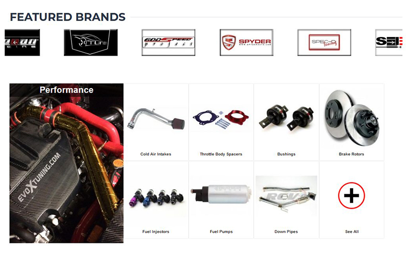
Promoted categories and goods
Some are tempted to use just a few rows of items, but this is not a recommended strategy. Featuring only curated items on the homepage, it narrows down the visual presentation of the catalog collection that the store holds. This is particularly a matter of concern if the store offers a variety of goods and does not include all types of products.
Based on a quick page overview, the consumer may conclude that the store does not carry any of the products that they are interested in and leave. A much easier solution is to combine categories of products to ensure the depth of the catalog and the variety of products is understandable to consumers.
A common approach is to view the main navigation and some essential subcategories on the contents of the home page. This is perfect if category browsing is an important product discovery strategy for the target market (such as the fashion industry) rather than a search strategy. Unlike main navigation, the content categories on the homepage have far more freedom of choice and visual appearance. They can be promoted using pictures, various text types, icons, and more.
Another common approach is the use of “inspirational” (thematic) routes. This is ideal for consumers who come to discover or look for thematically-oriented items (such as Valentine’s Day Gifts) and need some inspiration or guidance for purchase. When using thematic categories, bear in mind that they can only be used as an extension to standard categories. Customers who know what kind of items they are searching for would not be able to find them in thematic groups.
When displaying products on the homepage, also ensure that products from various categories are displayed to assist in the presentation of different product ranges. Don’t focus exclusively on goods that you might find appealing, those that have a higher profit margin, or those that don’t sell well, but you’d like them to. Featuring isn’t a guarantee they’re going to sell. Run frequent tests of this segment, particularly if you run a wide range of products because it’s hard to pick the products that customers would be interested in. This section is frequently skipped in many stores.
Check your analytics for goods that people scan and purchase and combine with industry trends and products that you might want to feature for whatever business purpose you have.
Proposed value & exclusive selling points
As customers land on your Magento store’s homepage, they begin to form their view of the store. They need answers to questions such as:
- What is the variety of items that the store carries?
- How are they going to benefit from shopping here rather than elsewhere?
Various types of value proposals or specific points of sale can be used to respond to the second. These may be anything from short sentences to more in-depth explanations. The idea behind it is to boost perceived value, to set standards, and to create trust or relevance.
Few tips for building a value proposition:
- It ought to speak to your market,
- It ought to be special,
- It should be quick to understand.
Additional materials, such as blogs, testimonials, reviews, etc.
Additional content adds value to the perceived value. You may generate more content to engage future customers and add fresh content to the search engines.
Having a blog, for example, makes you an industry expert. It benefits your SEO because it creates more content and creates a community. It also helps develop brand loyalty and promotes social media marketing activities. You might claim it’s a free marketing tool.
In the same way, testimonials, like product reviews, drive conversions, and support SEO. They are convincing because they have social evidence – a psychological phenomenon focused on the premise that people are more inclined to imitate the behavior of others. Social evidence helps by exploiting current customers to sell to prospective customers, and 61 percent of customers read feedback before buying.

We discussed the basic approaches to the design of the Magento homepage. Hopefully, we’ve given you some ideas about how to enhance your user experience by modifying and adding new content to your homepage.


