 Skip to content
Best UX practices to create stunning Magento product pages
Feb 11, 2021 | 8 min read
1. QuickRead
Product pages are the focal points of every online store. They bear considerable weight in the buying decision and are also the landing pages for people coming from search engines. It is therefore necessary for product pages to perform flawlessly for customers.
Magento’s product page layout contains a range of main elements, such as product name, product gallery, descriptions, pricing, CTAs, feedback, and upsells. Even, there is plenty of space for improvements that can be integrated into the design of the product page.
We’ll cover some of the basics of Magento’s product page design and see how we can use existing features and extend them to add more benefits to both your customers and your eCommerce company!
2. Breadcrumbs
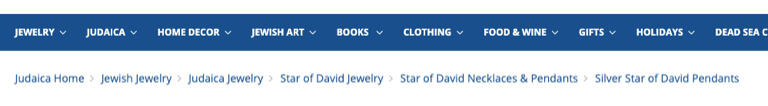
Some people find breadcrumbs trace an excess of information or simply find them visually unappealing, particularly if they appear to split into two or more lines. However, the breadcrumbs are very useful for consumers when deciding their place in the site hierarchy or moving back and forth between the category and the product pages.
When a customer lands on the product page from the SERP (Search Engine Results Page) page, breadcrumbs become significantly more relevant. In such cases, Magento will produce the “Home/$(product-page)” form of breadcrumb by default, but this is not such a great solution. By looking at the breadcrumb, consumers would not be aware of the location of the product in the catalog, that is, the parent group for that particular product. If the consumer wants to see more products from the parent group, they will have to browse to find and guess what category the product belongs to.
A simpler way is to set the breadcrumbs to reveal the complete group hierarchy. If consumers want to find more related products or potential product combinations, they can immediately recognize the category to which the product belongs and browse more products.
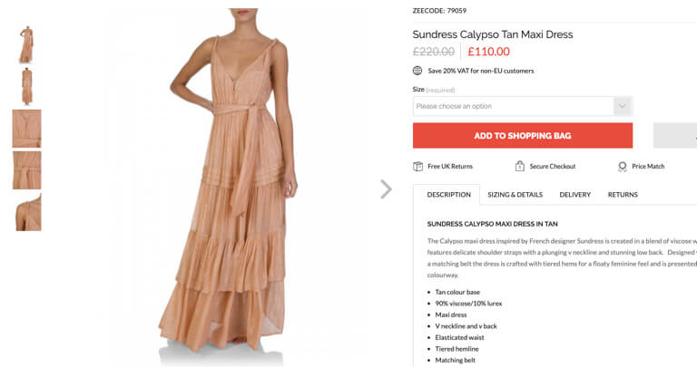
3. Product pictures
Online shopping doesn’t get the actual product in front of the eyes of consumers, or the texture under their fingertips. It’s always nice to have high-quality pictures to help clients get a better perception of the product. Images should portray the product from several angles. Someone purchasing a product online wants to have a clear idea of what they are buying, so it is definitely a must to have high-quality product imagery. The buying decision can be seriously hurt by low-quality imagery. When looking at a grainy and low-quality image, consumers will easily be dissatisfied because they are likely to have a negative or completely wrong perception of a product.
A common trick to use is to have at least one image representing the product within its natural setting, i.e. an image representing the product on a scale. This helps clients get a general sense of the size or helps them to imagine the object in their own environment.
Close-ups
It’s always nice to have close-up images if a product includes specific textures or details. Imagine purchasing a guitar amplifier from a client. Even before checking the product specifics in the summary, he would certainly look for all the available knobs to see the amp features and effects. Be sure to provide at least one picture of each color if the product comes in a range of colors.
Zooming
The zoom is another often overlooked element. More specifically, the zoom level is often inadequate. Customers would not be able to get all the visual information they need if the platform provides a small zoom or if the zoomed images are low-quality.
Audio, Video
We suggest that videos be included, particularly if it is better to see the product in action (such as the curling iron). You can show goods in action this way and explain their characteristics as you would in person!
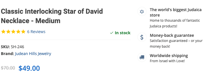
Main Buying Area
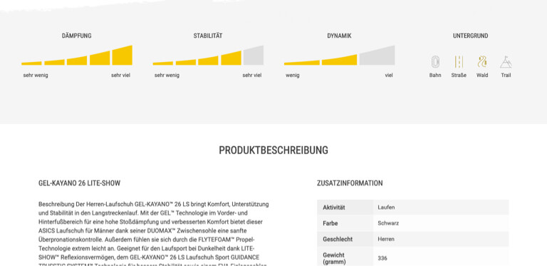
One of the most important page areas is the primary purchasing area. This is the first place where consumers can find any product descriptions, costs, availability, potential product variants, and add the item to their shopping cart, of course. How do we build the page to enhance our customer experience, apart from the obvious product name and price?
Content highlighted
Any type of highlighted content is always welcomed in this area whenever possible. This is the place to put it, whether it’s a few primary product attributes, shopping-related details (such as shipping information), special sale proposals, or similar information that can help consumers make the buying decision.
We’re used to seeing shipping related information, for example, shoved in the page footer and nowhere else on the page. Still, on the product pages, the information should be quickly discovered because it can play a major role in the buying decision. For such information, don’t expect customers to always scroll to the footer. If that’s the first place they find shipping detail, we see customers often abandon the cart and the checkout.
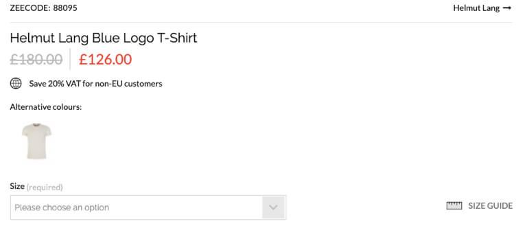
Variations of Products
By default, the configurable product options for Magento will be shown in the main purchase area. However, similar products with various features can be configured as basic products several times. For example, many single items will sometimes be configured as the same t-shirt or sneakers in a variety of colors. In fact, this is a perfect product listing method because all variations are immediately discoverable. On the product pages themselves, however, product variants should also be interlinked.
Imagine a customer landing on SERP’s black casual shirt product page (configured as a basic product) and thinking, “If only it came in blue.” If all variants are visible instantly, they would have no trouble finding that there is actually the blue one. They would not be as discoverable, however, if the variants are moved to the bottom of the page and combined with other upselling items (often the case). This easily causes consumers to believe that the store does not carry the item they are searching for and leave the website. Even if users want to try their luck to look for other combinations, if they are not interlinked, they would have an extremely tricky time locating them.
4. Layouts for product overview
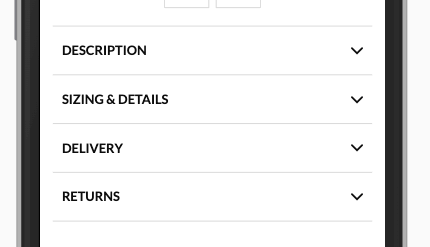
When faced with product specifications, the first thing that comes to mind is usually the horizontal tabs. For saving space and making the page shorter, horizontal tabs are perfect. Horizontal tabs are not the only way to go, and they do make more sense than any other technique often. Their biggest downside, however, is the fact that they hide the content. Any kind of hidden content still poses a danger that certain users will not find it. This can cause them to quit the website. Without hiding the information, what are some other ways we can present product descriptions?
Display Everything
If the page is not content-heavy, this approach works, and the layout can be split into 2-3 semantic columns that typically suit the viewport completely. It removes the possibility of content being difficult to discover, provides an exemplary summary of information, and makes it easy to find it.
Long Page
Merchants will also need a layout that accommodates a lot of content. While tabs seem like an obvious choice, the long page approach also works well. The trick with long pages is to include a sticky table of contents to make it easy to reach various parts for customers. Even if the table of contents is not seen by clients, it’s always a nice fallback. For clients, all parts are available as they scroll.
Mobile Layout
The concept should be adapted, as mobile viewports are smaller. It is still possible to display all approaches here as long as the content length is sufficiently long to be easily scanned. Nevertheless, because a lot of content on small viewports creates a mess, longer content can need some collapse.
When it comes to hiding content, collapsing the content is close to horizontal tabs. However, because of the way the site is scanned (top to bottom) and the collapsed tabs that provide section names, it’s usually less of a problem because they give the scent of information. The most important thing to have when the material collapses is a simple sign that the contents are hidden and a way to show it. Typically this is achieved by directional icons (such as chevrons).
5. Social Proof
Social evidence introduces the impartial voice to the page and provides the product with more insights. For instance, before making a purchasing decision, when uncertain, clients would check feedback for more details. A lot of times, feedback in the store will not be enabled. Out of fear of negative feedback, it is not uncommon to see merchants turn this feature off. Nevertheless, after product photos, social evidence is among the most relevant material on the page. In addition to the native Magento reviews, to further convey review validity, consider using 3rd party trusted review providers.
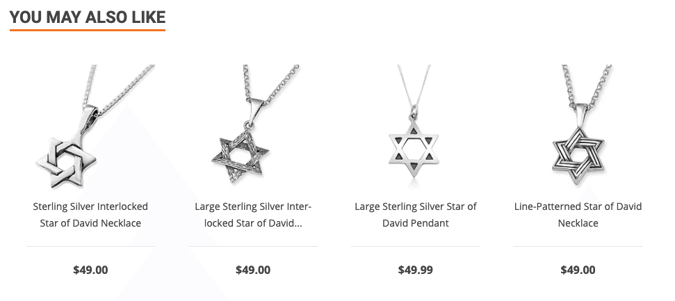
6. Upsells and cross-sells
It is important to provide replacement goods and accessories on the same website, similar to the variants of the product, so it makes it easier for the consumer to find them. These will keep them browsing your store and avoid leaving if the product does not meet the standards of the customer. Similarly, recommending product accessories makes it easier for consumers to find the right ones to see if they fit without needless scanning of categories or comparing specifications. Imagine purchasing a new phone from a client. They’ll probably even want to buy a case for it. When you can give them a range of compatible phone cases on the same page, why make them browse and filter another category?
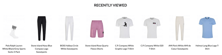
7. Items viewed recently
Customers may often want to go back to a product that they have visited before. Maybe comparing it with another or checking compatibility, but if you depend on the back button of the browser or try to re-find the items within the category, this can become quite a complicated job.
It’s always important to have a list of previously seen items in order to make it easier to return to previous products.


