 Skip to content
2. Sign in link not visible
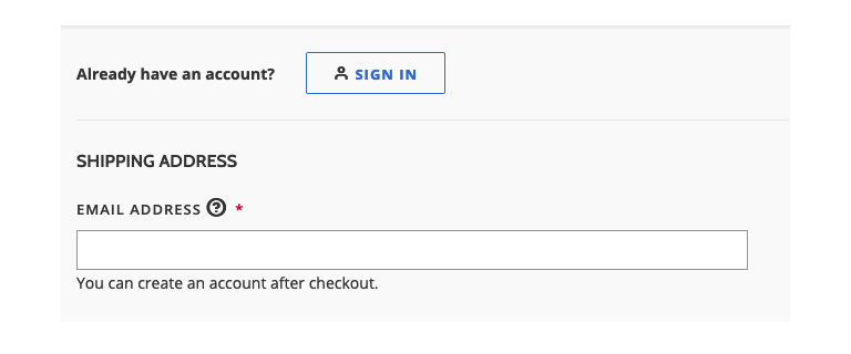
Magento 2 checkout by default allows guest users to make purchases with an option to register after placing an order on the Success page. As soon as they land on this page, registered users who already have an account can look for the sign-in option, but the sign-in connection is not sufficiently available.
While Magento can display a password field for registered users after entering their email address, this is not good usability since users are not familiar with what is going to happen. Users who know that they are already enrolled will aggressively pursue the option to sign-in.
For this reason, we recommend that the sign-in link above the email field should be highlighted as a call to action button to avoid oversight.
3. Hidden order description for mobile devices
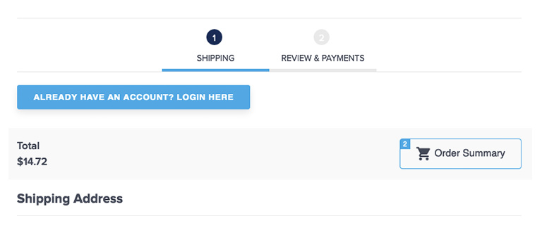
The order summary box is located in the right column of the desktop edition and is hidden under the mobile device cart icon. Many users on mobile devices are not aware that they can find a list of the order. This is particularly troublesome in the second step when users choose to double-check order specifics and shipping information before clicking the “Place Order” button.
The solution to this usability problem can be very simple. Adding the “order summary” label next to the cart icon would be clear enough, and users won’t have to wonder where to click to find that detail.
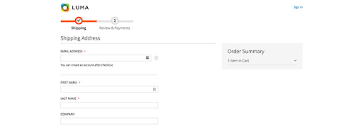
4. Confusing field of address
The shipping information type is well organized and clearly indicated in the appropriate fields. Even, we’ve seen users having issues with the address field on several projects. By default, the street address has three input fields and only one label.
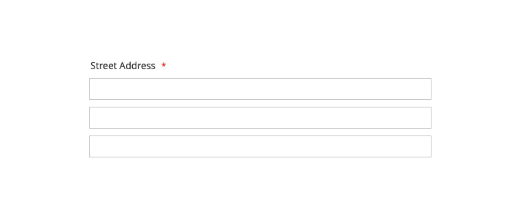
Many users are puzzled and don’t know what to type in the second and third areas. These fields are optional, but this is not obvious because Magento could not indicate that.
It should be made clear that users will leave the fields empty. It is also possible to delete the third line, but be careful if you already have customers who saved the address with three lines because they will get the “Street Address cannot contain more than two lines” checkout error in the Place Order stage.
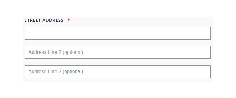
The simplest approach will be to add placeholders in Address fields 2 and 3:
5. Changing billing address
One of the best practices on the checkout page is to use the shipping address as the default billing address, and Magento uses the pre-selected checkbox to do so. While this seems to be the best answer for a few ventures, we’ve noticed that some users who wanted to change the address didn’t know how to do it and couldn’t finish the order.
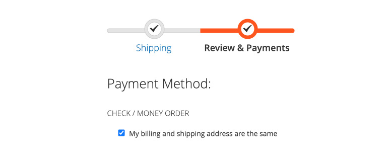
As far as usability is concerned, users should be able to see where they can change their billing address. Unchecking a checkbox is not intuitive for many of the users we’ve analyzed.
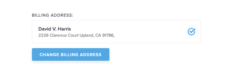
One alternative may be to view the address so that users can verify once again if all the information is right and the “Change Billing Address” button for users who would like to use different billing addresses.
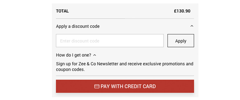
6. Position of Coupon Code field
At the end of the checkout process, just below the Place Order button, there is an “Apply Discount Code” connection, which informs users that you can get this product cheaper if you know the code.
For that reason, some of them are going to Google to search for coupon codes and leave the web, and there’s big risk some of them may not come back.
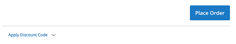
The location of the coupon code area is a tricky matter. If you delete it entirely from the checkout and leave it on the shopping cart page only, users who miss the cart page (there is a direct checkout connection in the mini cart) will be disappointed because they won’t be able to use the code if they have it.
If you don’t use coupon codes often in your promotions, this could be a solution, but if you need it and leave it at the last stage, some users will leave the web, and when looking for codes, they will see advertisements for rivals and maybe find a better alternative.
But what are we supposed to do to encourage users with code to use it and keep other users on the site?
If you have a global campaign and all orders qualify for a promotion, make the code available on the web all the time, including the checkout page.
If only some users have a coupon code, the simplest way will be to add a helper text or icon near the coupon code field and clarify how to get it.
If you use an email for a promotion, the URL should contain a parameter stored in the user’s session so that you can view promo code fields only for those users.
The final decision of the coupon-code field location will depend on the frequency and types of promotions you use.
Concluding
Any change on the checkout page, even the smallest, can have a huge effect on conversion and sales. For this purpose, you should always track how users communicate with your store and test gradual design improvements.


