 Skip to content
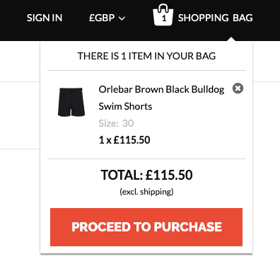
2. The Mini-cart
The primary aim of Magento’s mini-cart (or drop-down cart) is to provide a quick overview of the items previously added to the cart. Its trigger is normally located inside the main header somewhere. It is accessible across the site, irrespective of the type of page a customer is currently looking at.
Some eCommerce stores are steering away from the functionality of this nature. Clicking the cart button in the header will also take the clients to the cart tab. Mini-cart, however, is a fairly useful feature, regardless of the industry. To check compatibility and match with other products, consumers will also need to remind themselves of the products already in the cart.
A customer noticed a cute bag, for example, and attached it to the cart. Now the client is searching for some shoes to match the design of the bag. After doing it a few times, moving back and forth from the main cart page to various product pages would become tedious.
However, customers can easily look at the previously added purse for a fast style rundown whenever appropriate, using the native mini-cart features of Magento.
In a brick and mortar shop, just imagine the same scenario. Are you going to leave the purse at the cash register and search for shoes then? Or continue to search the shop with the bag in your cart?
Besides its “reminder” functionality, once the client adds a product to the cart, the mini cart can also act as a feedback signal. You can simply cause the mini-cart to view instead of cluttering the interface design with success messages (or modals) that confirm a successful cart addition!
The mini-cart design should include a way for customers to access the full cart page rather than displaying items in the cart, but can also provide a checkout shortcut for customers who do not need to visit the cart page for some reason and want to jump straight to the checkout process.
Another really helpful mini-cart feature is product manipulation. Similar to the cart page, it is also possible to customize a mini cart to edit items on the fly. A consumer can thus easily delete a product from the cart, for example, without leaving the page he is currently on.
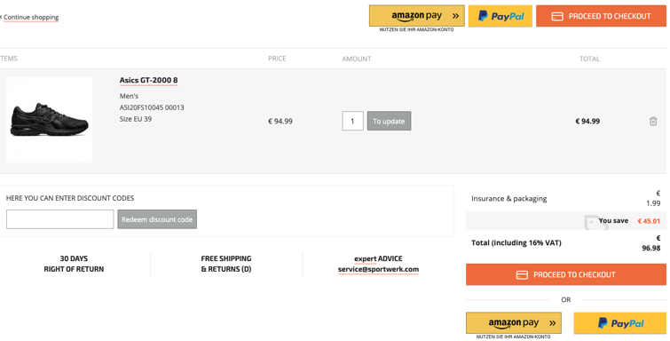
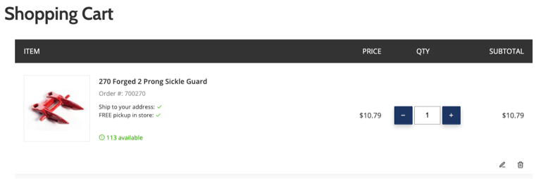
3. The cart page
Before actually placing an order, Magento’s cart page includes an order overview and an opportunity for the final check.
Customers are usually more likely to scan the page to read it in-depth, so it is a must to make the cart page easy to scan and transparent. However, one of the most common problems on cart pages is that instead of offering simple and concise templates, they are often visually cluttered.
Cart pages also contain various materials that can easily draw focus away from the action we want customers to take, by clicking the “Checkout” button. Whenever any kind of content that is not relevant to the purchasing decision is included, please be careful not to make the cart page design confusing, difficult to search, and sluggish. Ask yourself, three rows of “customers also bought” and “real customer reviews” are really appropriate for those advertising banners.
Customers are likely to feel irritated when confronted with these cluttered layouts. It may all sound like commercials that disturb their shopping experience, steering them away from the purchase quickly. Bear in mind that the main aim of the cart page is to drive clients forward to the checkout, so the less annoying stuff on the page, the better. Always weigh what is important and stay away from any features that do not influence the decision to buy or provide the consumer with any kind of benefit.
So what is needed on the cart page?
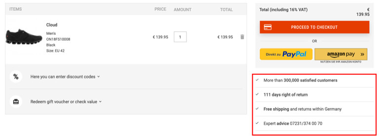
Overview of Products
Similar to product sites, goods in the cart can use high-quality photographs and a comprehensive product description. Often provide attributes chosen by the customer (such as size or color) if optimized for the product. This is particularly important if multiple products and their configurations are used with the same thumbnail. Customers would still want to double-check whether the right thing is being ordered. They’d blame you if they got it wrong.
If the product is configurable, offer the edit option at all times. Do not have your customers remove and re-add an item from the cart because they have changed their mind about the product’s color, size, or some other attribute.
Similarly, always provide a quantity manipulation option. Even if a single product is mainly purchased by your consumer segment, there’s always a possibility that someone will want to buy more. It is much better to have the option of increasing (or decreasing) the sum in the cart than to return to the product page and add the same product to the cart.
Regulation on shipping costs and returns
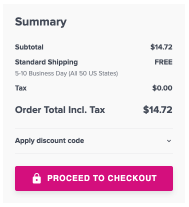
One of the significant features of Magento is that it provides a shipping calculator on the page of the cart. It is quite a useful feature when set correctly, that allows customers to check the shipping cost quickly and decide whether to continue with the purchase.
It is important to remember that in the purchase decision process, shipping costs often play a part. Unfavorable shipping costs would impact the rate of cart abandonment and it is not much you can do here in terms of design. However, prior to hitting the checkout, it is often better for consumers to be informed about the shipping cost (or any other extra for that matter). Once they have already made a buying decision, you don’t want to surprise them with additional fees.
Even if the shipping calculators are not used (for whatever reason), make sure that on the shopping cart page you do have a shipping cost details or estimation. A prominent link to the shipping details page is enough for the bare minimum. By doing so, on the checkout tab, you are removing the potential negative surprises of additional costs, thereby reducing the rate of checkout abandonment. Never depend solely on the link in the footer for shipment details!
It is overlooked by many retailers, but it is also often important to include return information along with shipping information. Return data may play an even more important role in decision making for anyone purchasing with a dose of uncertainty than the shipping cost. Do not depend solely on footer connections, similar to shipping information!
Trust Sealings
People want to feel safe when they buy online. Trust seals are small markers that show your customers that your store is safe and reliable. They come in different sizes and shapes, but it’s important to remember that there are two main styles of badge.
The first concerns third party providers – specialist companies that grant security certificates based on your certification application. You can add the badge to your store after you have been approved. Customers can then quickly check that the store is legitimate simply by clicking on the badge on your store and making sure that it is not on the scam site.

The second form is about showcasing some of your store’s unique selling points to increase the perceived value. From free delivery to money-back guarantee badges, these can be anything. For eg, if you are offering above the average return time or free shipping, you can visually show it off! Steer away from generic claims such as “Largest US apparel store.” Give the consumers an actual value that can provide added value.
A clear hierarchy of buttons
The cart pages may contain different buttons for various acts, depending on the content, such as updating, applying, editing, etc. Nevertheless, always make sure that the primary “Checkout” button can be differentiated from other ones. It easily creates confusion about what different buttons do by making all the buttons visually identical in size, shape, and color.
4. Additional contents on the tab on the cart
Options for Coupon Code
A perfect marketing tool is coupon codes. They come, though, with their problems. A lot of customers who see the code options, but don’t have a discount code, will feel it’s unfair they didn’t get the discount. Some others would try to get a coupon code from Google, leave your store, and probably never come back.
Make sure they’re not as highlighted to avoid these scenarios when including coupon code options on the cart page. The most simple approach is to hide the coupon code behind a text link (e.g., “Do you have a coupon code?”), which opens the actual customer click field.
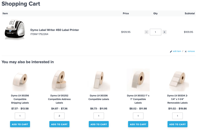
Cross-sells
On the cart page, cross-sells are usually complementary or goods related to those in the cart. Do not mistake them for up-sells, as up-sells, usually in higher product ranges, are the same product types. They should not appear in the cart, but instead on the pages of the product. Remember that cross-selling targets that final impulse purchase (like picking up a pack of gums on the cash register). You don’t want clients to rethink the purchase of the item already in the cart, which can easily lead to the abandonment of the cart. Always pay attention to what to offer to complement the items in the cart. It won’t make sense here to offer random products.


