 Skip to content
Jan 29, 2021 | 08 min read
1. QuickRead
The category pages act as a bridge between the homepage and the product pages, one step closer to discovering the right items for consumers.
They are an important step in the purchase path for customers who are browsing the store using main navigation rather than looking. They are also among the top pages on which customers can land. It means that a lot of users are beginning their browsing and shopping phase here. That makes them even more critical.
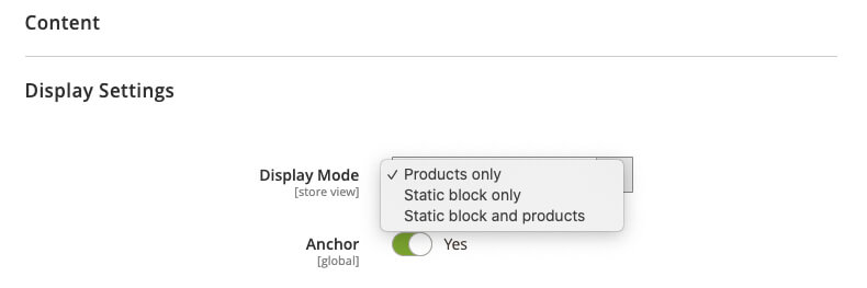
It is possible to set up Magento’s category page layout in three ways:
- Landing/intermediary (static-block only),
- Listings of Goods (display products only),
- A mixture of the two previous ones (products and the static block).
We’ll discuss all three methods and how they can affect the design of the Magento category page.
2. Magento Intermediate Level Page
The intermediary category page allows the customer to pick a more specified scope before reaching the products. It’s almost like a homepage – for that particular category. It guides the customer deeper into subcategories, promotional items, and other b, such as blogs or guides. This is why intermediate category pages also have tasks similar to homepages – conveying the range of the category and displaying various purchase routes.
Similar to the homepage, all content can be personalized. Unique custom design can make content, and in particular, categories much easier to search and understand, particularly if they are jargon driven. You can’t expect everyone to understand any industry-specific jargon, but you can definitely make it easier to understand its significance.
Intermediate pages can support various classes of users:
- Users who are not looking for a particular product and need any inspiration or guidance,
- Users who are looking for a specific form of product and can easily recognize the category,
- Users that select the top-level category instead of the primary navigation subcategory.
When and why set up a static category only block page?
It doesn’t make any sense to show product listings for a top-level category often. These lists may be too long, disorganized, and generic. This is also the case when the parent category has a large number of subcategories.
One may argue that it is necessary to use product only configuration because child categories in the layered navigation would make it easy for a customer to pick a category. Still, in circumstances where there are more than ten child categories, nothing beats the clarity of the intermediary category tab.
Imagine a clothing store where the navigation is usually gender-dependent on the first floor. A collection of 25,000 items from 26 different categories is introduced to the consumer on the basis of gender. Apparel stores are often filled with subcategories that depend on industry-specific jargon. It ranges from thematic (e.g. “prepare for winter”) to material-related (leather collection) labels. Subcategories of the layered navigation are in text-only format. The customer has no idea what’s behind the subcategories.
See how easy it is to get lost on the catalog pages?
Even a simple jacket shopping can quickly lead to a bad scenario for both the customer and the retailer.
Structure of the intermediary category page
When using intermediate category pages, subcategories should always have the most important position on the page. This typically means that it’s close to the top of the hierarchy. Contrary to the myth, people do scroll – but they still rely on what is above the fold as they develop an opinion about the page and what they can do about it.
It is a great addition to items, inspirational buying paths, or other auxiliary material. However, these forms of material should still be of secondary importance.
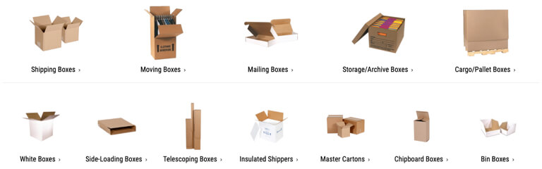
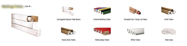
Subcategories
In comparison to the text labels in the drop-down menus, the landing page subcategories provide many more options in terms of visual appearance and custom design. Using photographs and different text types can help to build both visual subcategory presentations and their hierarchy, i.e. parent-child relationships.
Imaging is a particularly useful piece of knowledge because it provides a much better preview of the category than a text mark. It becomes much more important if consumers are not familiar with the technical terminology of the industry. A thumbnail and a clear text would mean a lot more to consumers than a text label they can’t quite understand.
Apart from product thumbnails, one approach that we sometimes find is the use of images where products are placed in context. For example, a sofa shot in a decorated living room (including a table, a rug, a chest cabinet, etc.) or a model wearing a complete outfit. However, this method leaves the image open for interpretation, since it is full of various product types. When using such imagery, it is essential to focus on the types of products and not the entire scenery.

Having a typical sidebar with textual links to subcategories may also prove beneficial. The textual sidebar is not as eye-catching as thumbnails and can be misinterpreted, but some people would still choose text navigation because it’s much easier to read through the categories than to search the graphics-heavy content page section.
Sub-sub-categories
Displaying subcategories is certainly important, but to get things on a different level, it’s also nice to have sub-subcategories as well. This is immediate support to consumers who may not be sure what sub-sub-category is going to be the correct option. It also shortens the path for consumers who already know the response because they would not have to search redundant category pages until they enter the product listings.
When combining subcategories with subcategories, it is important to visually indicate the hierarchy and parent-child relationship between them. This is generally done using indentations, lists, various font sizes, and the like.
Other related contents
As noted above, the intermediate category page design also faces a challenge in conveying the scope of the catalog and displaying various purchase routes. Using auxiliary material can be an efficient way to view various purchase routes, but it should never interfere with subcategories.
This content can be created in the form of featured items (such as newcomers or best-sellers), inspiring paths (such as latest trends or seasonal products and categories), or even guides. Such purchasing paths also help customers who are simply browsing, searching for details, and not looking for a particular product.
3. Magento Products Category List page
Traditionally, the product listing page consists of a list of items, filtering mechanisms, sorting options, and navigation in terms of pagination or loading of additional features.
The listing page has its share of design challenges – showing enough detail, but not cluttering the GUI. It should provide sufficient product details on the products of the product and allow the filtering to be accurate and similar. Let’s look at these.
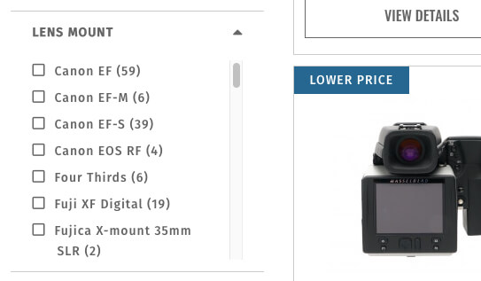
Filters and attributes of a product
One of the big usability problems we frequently see is weak filtering choices, which are directly linked to Magento’s product attributes. Filtering tools allow users to minimize the list of products of thousands of products to those of higher interest to them. It has a vital role to play in the ability of the consumer to locate the product.
It is not an easy task to find out which attributes of the product to view in the filter list. A good filter list should allow users to narrow down the scope precisely, however, on the other hand, it should not be a long list that produces an abundance of choices.
Apart from some relatively fundamental attributes such as price, color variation, or size, filters will rely on the form, category, and industry standards of the product. There is no one answer for all of them.
For example, for the list of shoe items, the attributes may be the style (sneakers, heels or flats), the material (leather, textiles, synthetics) worn by occasion (sports, every day, special occasions), and more.
Other than product attribute filters, another filter category to be considered is a compatibility-based filter. Some products simply rely on compatibility. Their compatibility dictates their maximum relevance to another product already owned by the consumer (accessories, laptop cases, etc.).
For example, if a consumer wants a power adapter for their laptop, they need to make sure that the two are compatible. Otherwise, the connector will be useless to them. Typically, using the brand as a compatibility filter would not be enough.
The lack of such filters can easily lead to missed revenue, nervous customers, and returned orders.
User-specified input
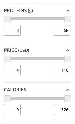
The filter is also a numeric data – price, weight, strength, etc. And they are typically viewed as ranges.
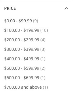
Although it’s better than not getting them at all, the ranges can hinder the ability of users to search, since they rarely fit the ranges a user is searching for. In addition, if more ranges are protected, the list of choices will either be very long or the range values will be so wide that they will no longer be successful.
The optimum solution for ranges is always to allow users to determine their own upper and lower range values. This enables them to receive a clearly defined list of items and prevents them from making several choices if they are only interested in a single lower and upper value.
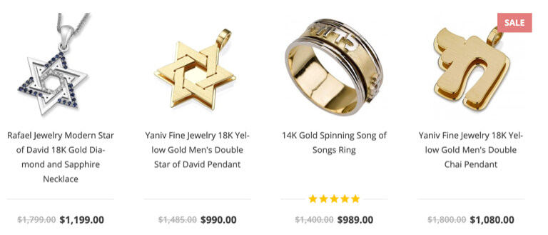
Categories page list item
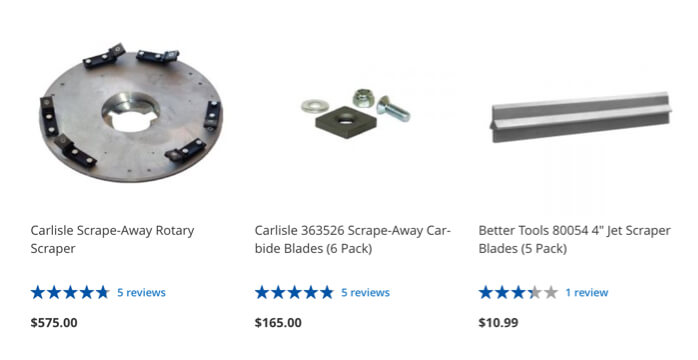
Determining the characteristics or features of the product to be shown on the list item is site-specific and product-specific. A successful list item should provide ample details to help the user assess the importance of the items correctly and easily compare them to the other items listed. Attributes such as title, price, and product thumbnails are typically fundamental. However, these are further generalized, depending on the particular type of store, product or industry.
One of the key characteristics that are often ignored is product variations (different colors, sizes, etc.) Without them, the consumer could miss the product they might be searching for simply because they couldn’t see the variety they would like.
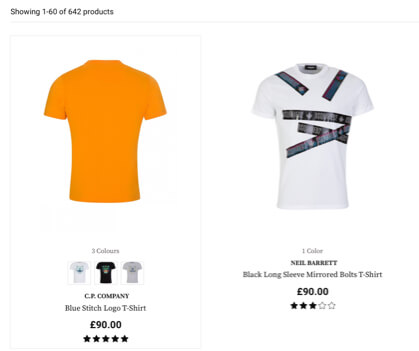
User ratings are also something a lot of traders prefer to stop showing, often even turning the feature off entirely. Both due to fear of negative reviews or lack of reviews in general, ratings are considered to be one of the main attributes. Whenever a customer is uncertain about a specific product domain, they are likely to rely on previous customers as a proxy to make a safe choice.
Many goods may have attributes specific to the category or industry standards, which may be the most relevant. Attributes such as dimensions, age rating, and the like may also influence the decision to open the product page or not. This can vary from industry to industry and from category to category but must be selected solely to help consumers make informed decisions.

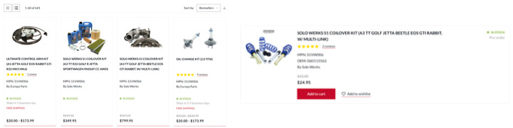
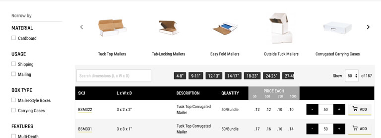
List or grid view
We’re used to looking at the grid view. It’s a great choice because it allows more goods per line and a lot of merchants like it.
Grid view is excellent for visually oriented items such as clothing or furniture. It allows the most important thing for this product – a larger thumbnail, that is, showing how the product looks. It also works with items that do not have aesthetics as a primary purchasing factor, such as vitamins or health and cleaning products.
In such situations, although the product is not visually oriented, consumers may nevertheless scan the website looking for images of something they know using a visually driven product search strategy.
However, not all product types can suit the grid view, particularly if the specification of the products is guided, such as TVs, laptops, etc. For these products, the requirements are essential to the selection and decision-making of products.
With more specifications available, consumers can better assess the items in the listing, and the list view provides more scope to use the specification. It saves consumers time to switch from a product to a product just to get to the list of requirements and see whether the product is applicable or not. With the specification-driven items in the grid view, it is very difficult to find enough room and balance for all the main requirements.
Magento provides both grid and list style views by default. Even, we seldom see customers using a switch, so the resources required to build both templates should be justified. If there is a strong consensus that one or the other is enough, it probably doesn’t make sense to invest in both. Apparel, for example, does not have any meaningful specs to use the list view. In the other side, most definitely do the machines. However, if goods border on visually-driven and specific-driven products, it might be worth investing in both.
4. Magento Products List and CMS Content
The third way to set up a page category layout is to have it both ways. This method has its advantages, but if it is not done correctly, it may lead to some severe misunderstandings about how the page works. It typically crumbles down to the “false bottoms.” We’ve seen this a million times before. A category page, packed with subcategories, layered navigation, all you’d find on a standard intermediate category page at full height.
But here’s the kicker – underneath all that content (which normally needs scrolling), hidden underneath all that CMS content – there’s a list of products. Why is this a matter? While people scroll, they are more likely to get an idea of what is expected of them when looking at the content above the fold. In this case, the list of goods would be reached by a significantly small number of consumers.
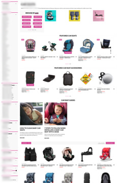
When combining listings with CMS content, it is important not to force the listing too far down with the content in order to avoid any dangerous misinterpretations.
Packaging Price uses both listing and CMS content in such a way that one does not interfere with the other.
And that’s the Magento category page. Stay tuned to the next blog post in this series “Best Practices for Magento Theme Design!”


